http://fontstruct.com/fontstructions/show/leds_19
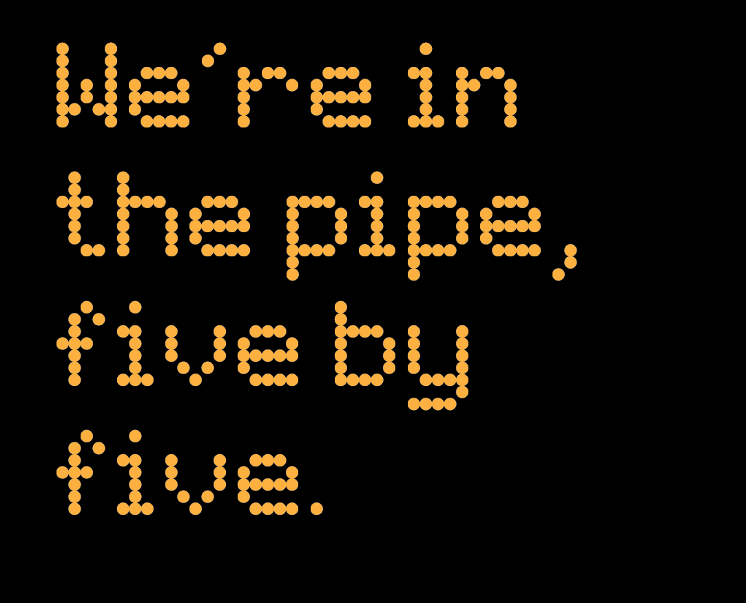
 http://fontstruct.com/fontstructions/show/led_wide
These fonts came out of my most recent job, working with Network Rail. I reproduced the alphabets, constructed from LEDs, which are used on customer information screens. This was in order to produce accurate, useful, and convincing mock-ups of these kinds of screens.
The original alphabets are a good example of what Erik Spiekermann would call apocryphal design, or work not deemed worthy of crediting to someone. It is also often referred to as the vernacular. http://spiekermann.com/en/learning-from-la-vegas/
I find these kind of lo-res modular alphabets fascinating and wonderful. Working within coarse constraints is something every designer should try, get good at, and learn to enjoy. I think the results have a charm of their own; utility has an aesthetic of its own, and this isn’t said often enough.