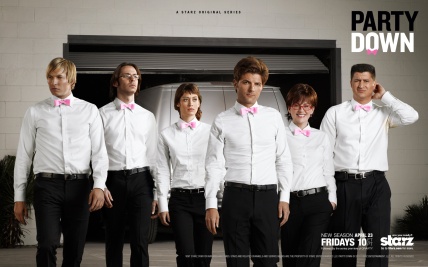
I love Party Down. http://www.imdb.com/title/tt1073507/
It is a great show, about LA caterers who are, or have been in a different life, actors and writers. It has an exceptionally likeable cast. It is very, very funny. It thematises, all too believably, the quiet desperation that comes with the barriers to ambition. I’m sure there are better reviews of it from a dramatic point of view than I can give it here.
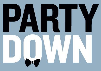
One of the things I like about it, and what I really want to talk about briefly, is the logo. It shows an attention to detail that could have just as easily not been there, and suggests a love of its purpose and a love of crafting graphics.
I’ve tried to find who did it in order to attribute it, but I can’t. So this is another thing I like about it (for now, at least – until the designer surfaces). It is anonymous, workaday. I’m guessing, or maybe I like to imagine, it was done in an afternoon without too much thought or effort.
It is a simple, immediate and unpretentious idea, bringing to mind a Bob Gill approach to problem conceptualising and solving. It communicates its concept clearly. It’s black and white, like the outfits of the characters. It wears a bow tie. Like the characters.
But the thing that really elevates it and sells it, the craft that goes the extra mile, is a simple but important detail. It is a piece of optical alignment. The stem of the Y of PARTY sits on the upstroke of the N of DOWN. If this detail was left to a computer, the stem of the Y would be tucked in neatly over the middle of the N, leaving a big messy hole under the side of the Y down the edge of the logo.
Some designer took the trouble to correct this. S/he let the Y sit properly in space. Maybe this designer had read and understood Techniques of Typography by Cal Swann, or maybe s/he just had a good eye.
In any case, the logo, which could have been an anonymous piece of hack work, a little blemish, is an anonymous masterpiece of its kind. It shows the care and love evident elsewhere in the show. It is a simple, unfussy idea, flawlessly and unflashily executed. And this is why I love it.
More on getting type detailing right here http://tonypritchard.wordpress.com/tag/typographic-detailing/


